Awesome Check-In v2
The newly designed version of the Awesome Check In mobile application is used by Awesome Inc to check in their guests and alert the appropriate team members
Brendan Thompson
Tags: projects Ionic

The newly designed version of the Awesome Check In mobile application is used by Awesome Inc to check in their guests and alert the appropriate team members
Brendan Thompson
Tags: projects Ionic
The Awesome Check-In Ionic application got an all new interface thanks to the mockup created by Nathan Faulls. Checkout the original project page for more information about the first version of the Check-In app.
Implementing a universal theme for Ionic apps is faily straightforward using the global Sass stylesheet. All of the classes defined in src/app/app.scss can be used on any interface template throughout the application. This makes it super easily to manage the look and feel of the entire application with just a few different project-scoped classes.
.cardFont {
	color: $thunder-black;
	font-family: Exo;
	text-align:center;
	text-transform: uppercase;
}
.cardHeader {
	@extend .cardFont;
	font-size: 150%;
	font-weight: 600;
}
.cardContent {
	@extend .cardFont;
	font-size: 100%;
	font-weight: 500;
	height: 100%;
}
cardFont was one of the most popular classes used throughout the application. Just about every single page has cards on it that needed to be formatted. This allowed for just one location to define many of the text style attributes while other styles like cardHeader and cardContent could simply extend the class. With this paradigm, almost all of the cards throughout could be styled by simply adding the correct style class to the ion-card-header and the ion-card-content. There is still an issue where some of the fonts are not working properly on the newest iPad even though they are working fine on the emulator, my Android phone, and the older iPads.
.card-red {
	background: $amaranth-red;
}
.card-gray {
	background: $oslo-gray;
}

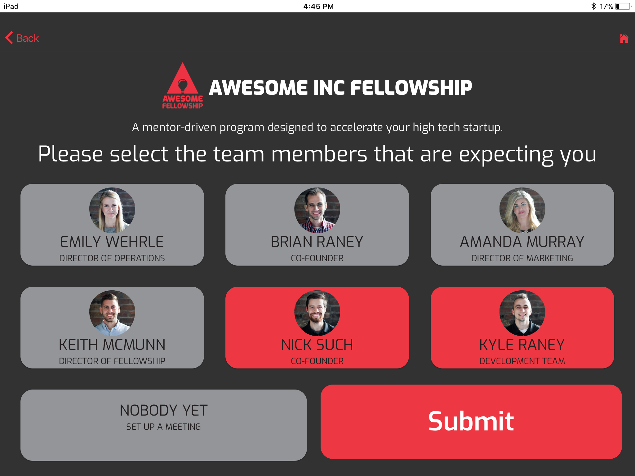
To handle the background color of the cards, the theme contains the global classes card-red and card-gray. With these two background styles declared it is simple to implement an interface that reacts to the user clicking on a card by changing the background color. This feature can clearly be seen on the TeamMembersPage where the cards all start gray but can toggle to red to indicate selection of the team member.
The power of Angular data binding allows for the syntax seen below from the html template. Upon the user pressing on a card the custom function cardClicked() is called which toggles whether or not the team member is selected. The card’s background color is managed using Angular’s [ngClass] with another custom function getSelectStatus() to handle getting the value for the conditional.
<ion-card (click)="cardClicked(member.tag)" [ngClass]="getSelectStatus(member.tag) ? 'card-red' : 'card-grey'">
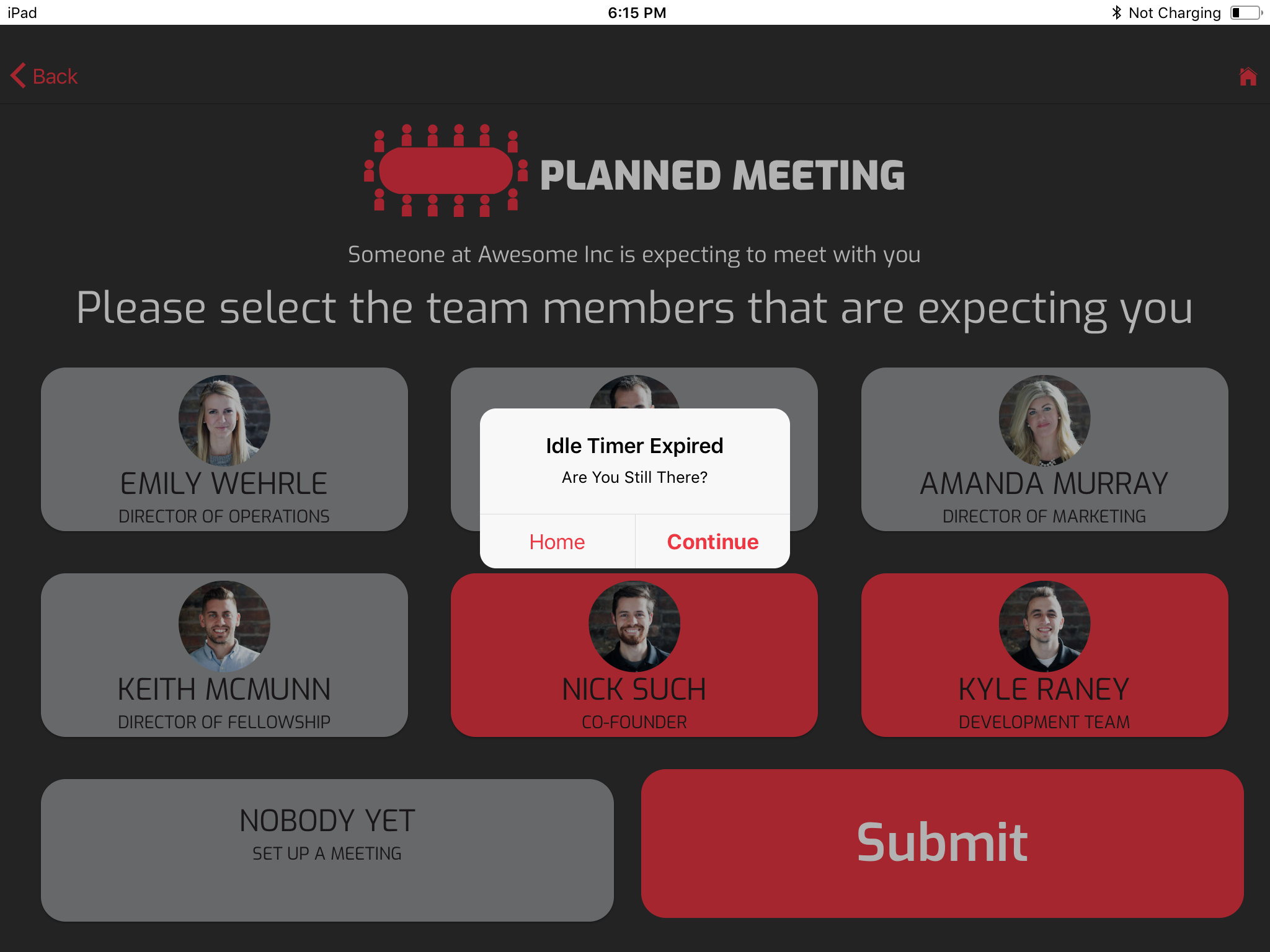
Aside from just re-designing the interface, a decent chunk of the underlying code was upgraded. The biggest change to the controller side of the application was with the way that the idle timer works. Before, each page had its own timer that was started upon construction and stopped when navigating to the next page. Unfortunately, when the user clicked the back button the timer wouldn’t stop. Therefore the user could have a bunch of timer instances all running at the same time causing duplicate notifications.
With the second version of the Check-In app I was able to make the TimerProvider itself significantly simpler. Also, the process of implementing the timer within a page is now much more straightforward. The home page instantiates the only instance of the timer which then gets passed along to the proceeding pages. Then the timer can be started within the lifecycle event ionViewDidEnter() and stopped within ionViewWillLeave(). Now it is functioning perfectly but the code still feels like it could still be cleaner. Specifically, each page still has its own copy of the code for the AlertController notification as well as a custom listener using the same time-tick system used by the provider. To fix the AlertController repetition I imagine Angular has a way to define an interface template for a re-usable module or provider. As far as the repetitive time-tick listener implementation, there may be a way to abstract that code into its own provider or maybe even build it in to the official TimerProvider.

It was a whole lot of fun to teach myself all of these new tools to develop the Awesome Check-In application in the first place. To then take it to the next level, thanks to the help of a designer, was a really exciting process. Not only does the app look significantly more legitimate, I learned a lot in the process. My skill with CSS/Sass, TypeScript, Bootstrap, and even Angular expended exponentially throughout the upgrade.